Articles
Warehouse Gym: A Bold Brand Refresh Designed for a Modern Fitness Community
Mar 31, 2025
In the world of elite fitness, standing out isn’t just about cutting-edge equipment or high-intensity training programs—it’s about identity. Warehouse Gym, a high-performance training space built for serious athletes, knew they needed more than just a great facility.
The gym had a reputation. The community. The results.
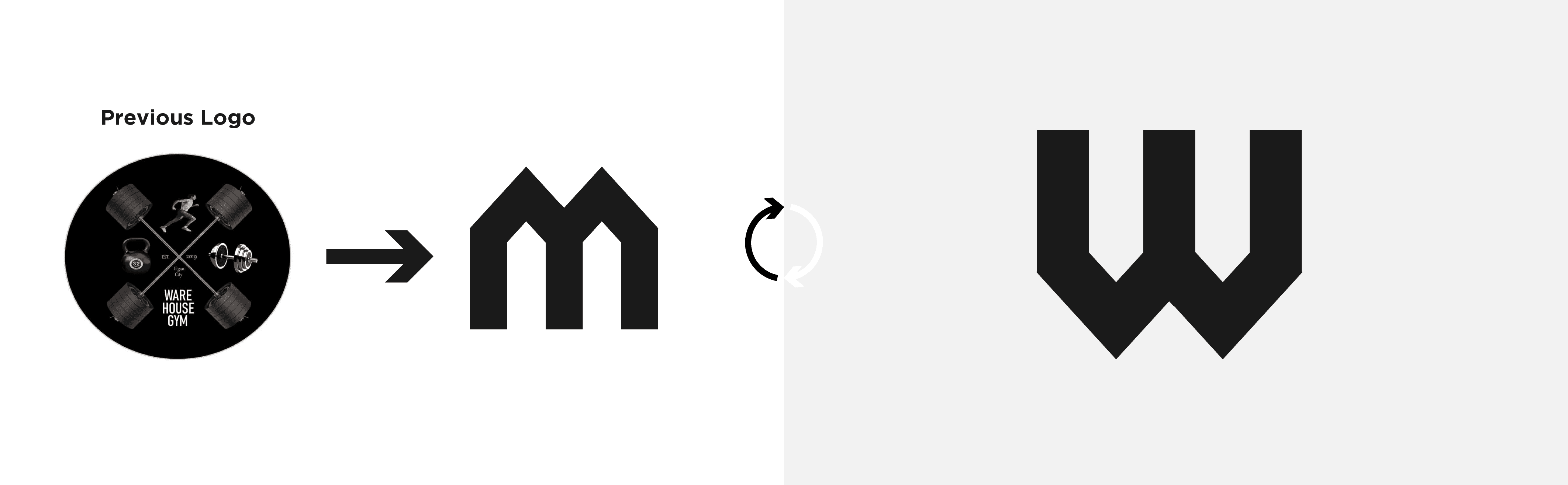
But as Warehouse grew, its branding struggled to keep up. The logo lacked scalability, the digital presence felt inconsistent, and merchandise sales weren’t reaching their full potential. In a competitive fitness landscape, a strong brand identity wasn’t optional, it was essential.
They needed a brand that could match the strength, discipline, and ambition of their community.
The Brand: Built for High-Performance Athletes
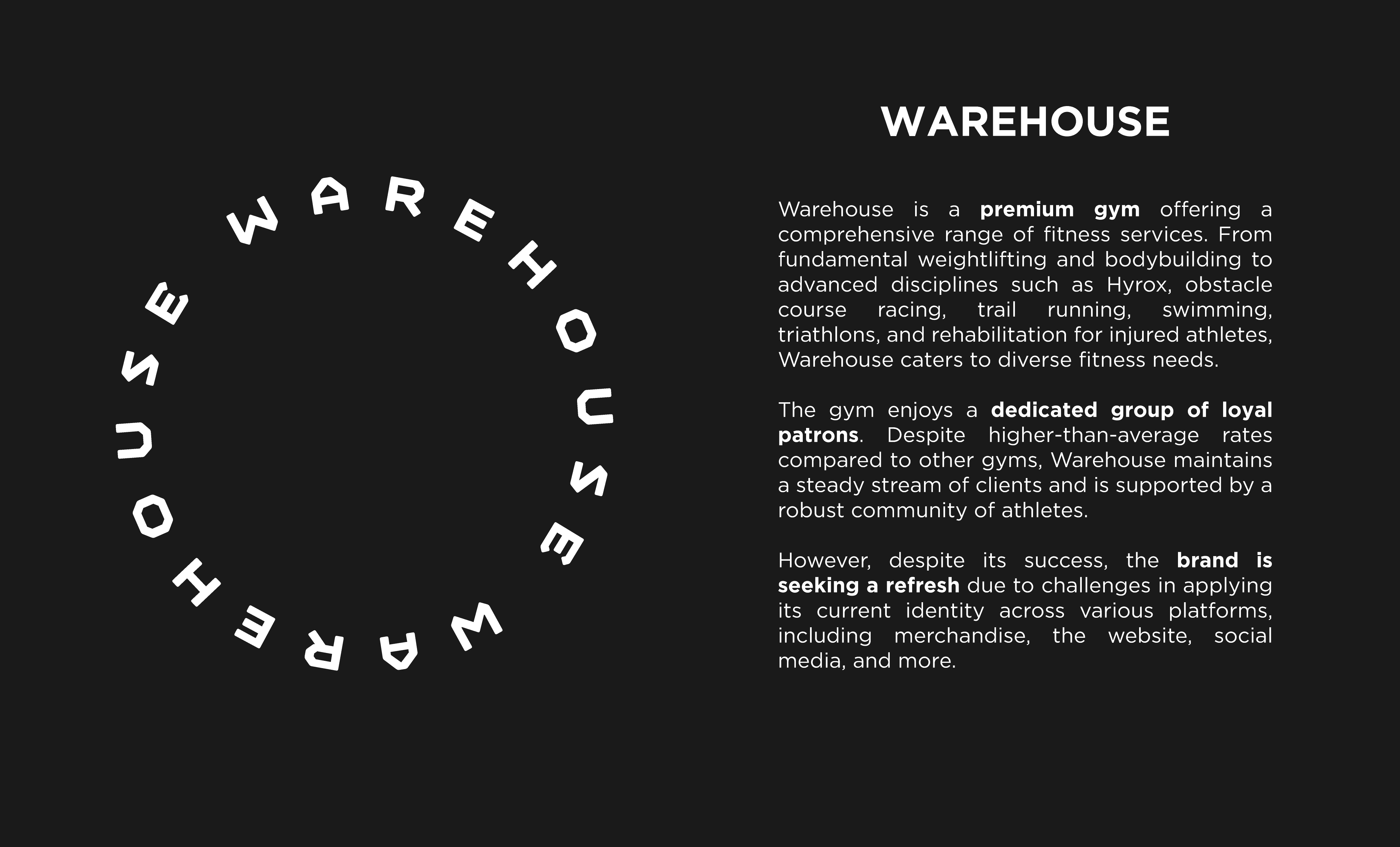
Warehouse wasn’t built for casual gym-goers. It’s a premium training ground designed for weightlifters, bodybuilders, Hyrox competitors, obstacle course racers, and endurance athletes pushing their limits. With its reputation for expert coaching and elite-level programming, Warehouse had already carved out a niche in the fitness world. But as its community grew, its brand struggled to keep pace.
The Challenge: Crafting a Brand Identity as Strong as Its Athletes
The primary challenge for Warehouse was scalability, ensuring that their brand could seamlessly extend to all touchpoints. The gym needed a visual identity that was:
Minimal, modern, and impactful
Easy to apply across merchandise, social media, and physical spaces
Distinctive enough to stand out in the crowded fitness industry
Bold enough to reflect the strength and power of its community
Additionally, Warehouse wanted to capture the attention of a younger, more social-media-savvy audience while still appealing to seasoned athletes and fitness professionals.
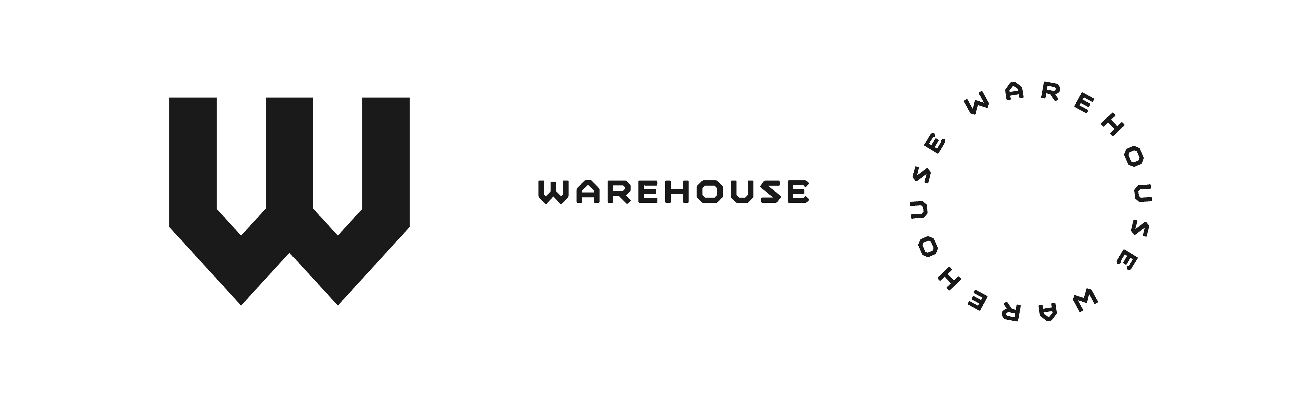
The Design Concept: Minimal. Impactful. Built to Last.
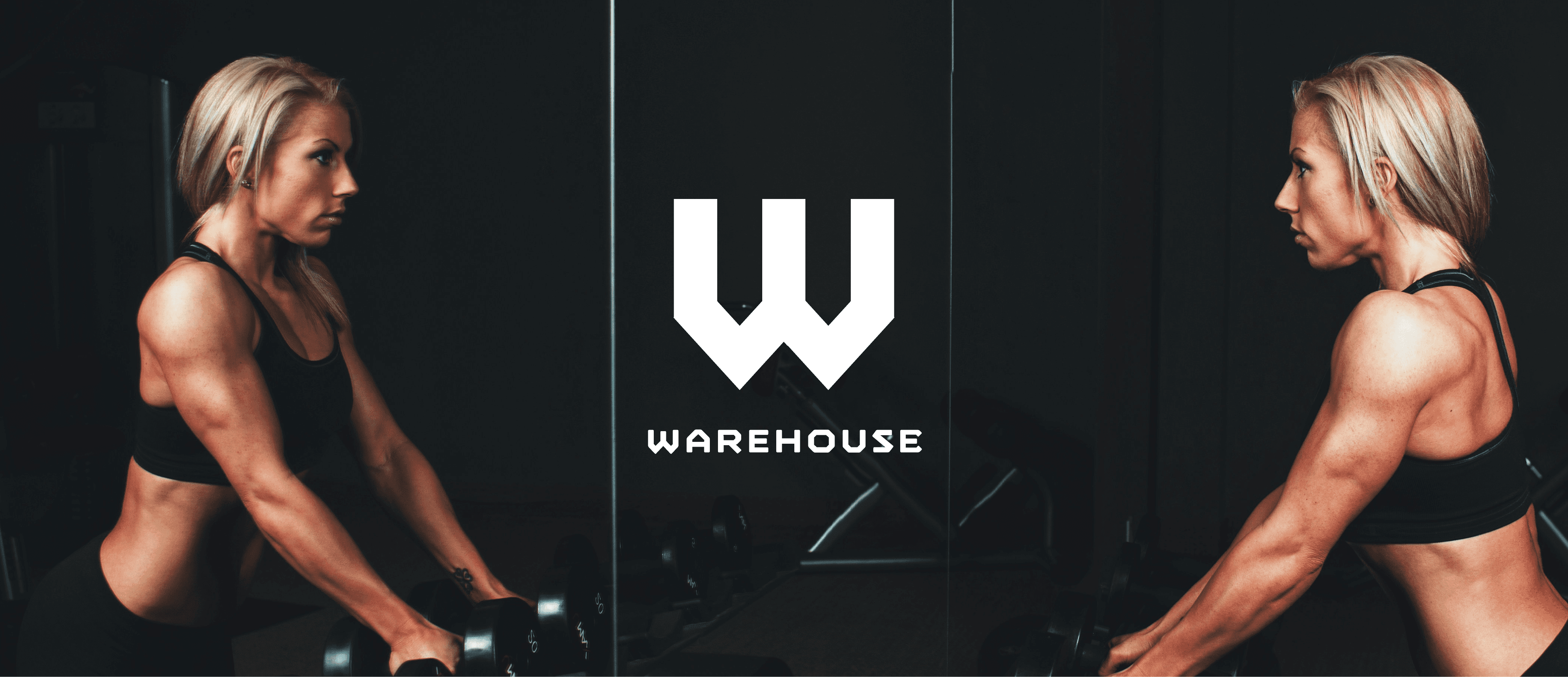
The name Warehouse speaks to its industrial roots, a raw, no-nonsense space where serious training happens. That philosophy needed to translate into a brand identity that felt equally strong and intentional.
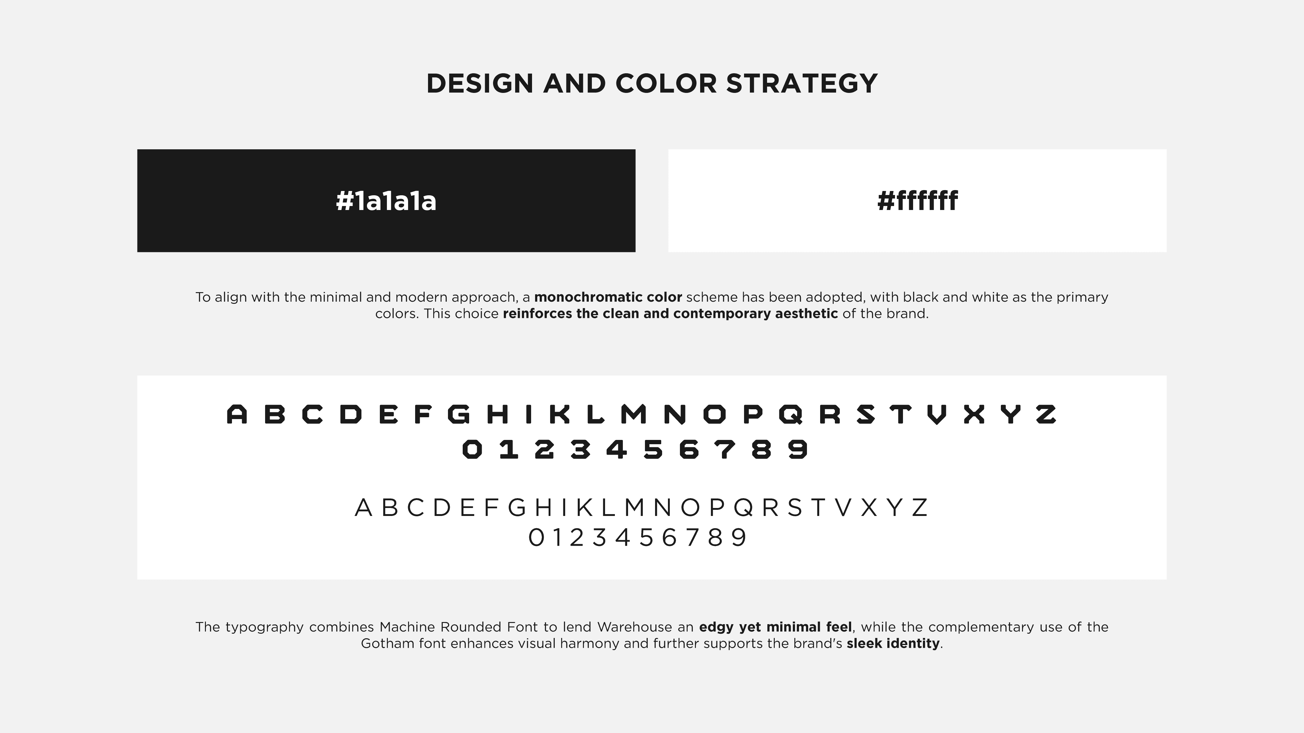
Playhouse Creatives stripped away the excess, designing a clean, text-driven logo that exudes confidence. The inverted roof icon subtly reinforces the idea of a space built for strength and resilience, while the monochromatic palette ensures a timeless, premium feel. This wasn’t about following trends; it was about creating an identity that would stand the test of time.
The result? A brand that commands attention without shouting—just like the athletes who train within its walls.
A Visual Identity That Works Everywhere
Warehouse’s rebrand had to do more than just look good—it had to work seamlessly across multiple platforms.
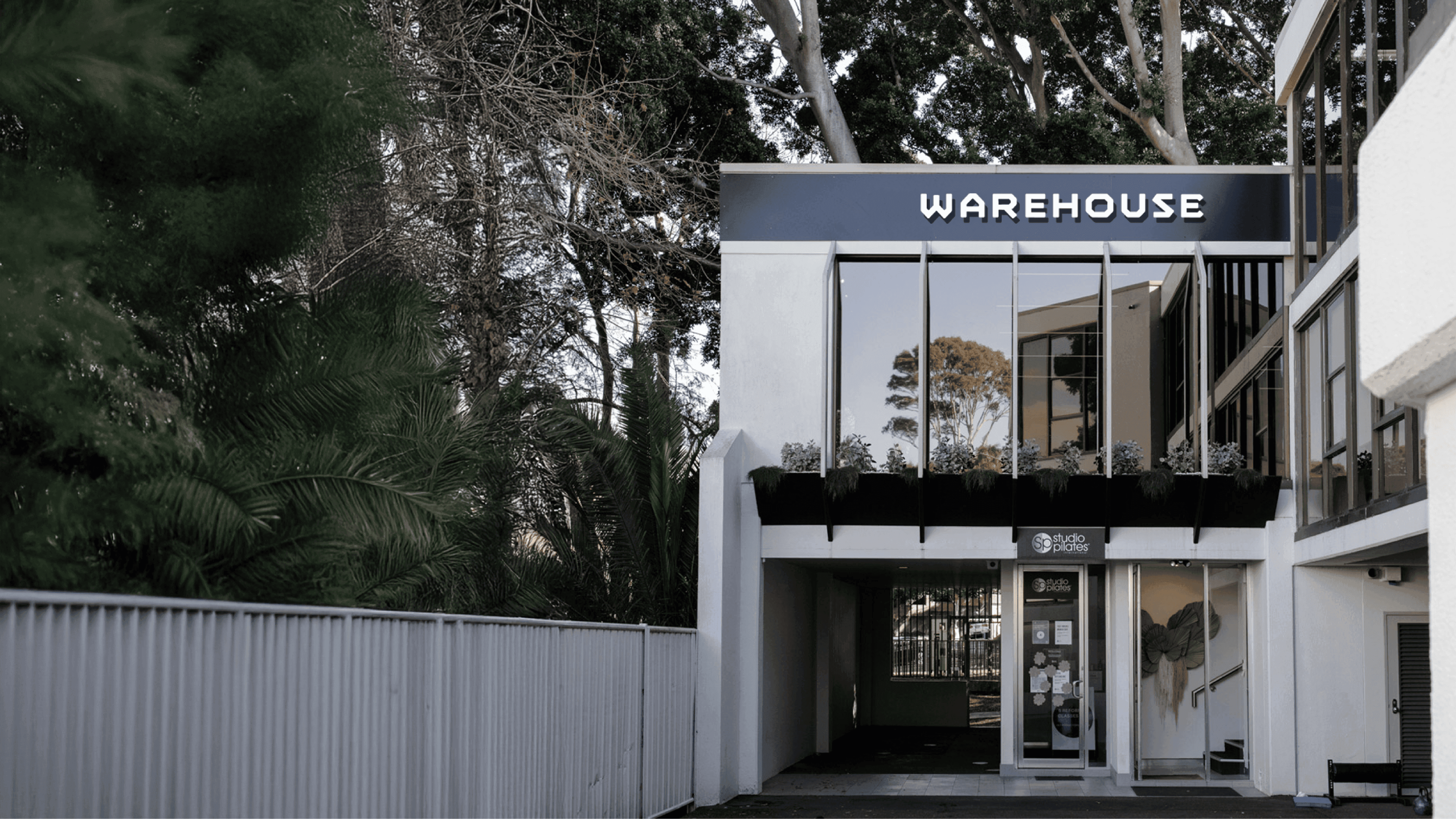
On storefront signage, the bold typography ensures visibility from a distance, making an immediate statement.
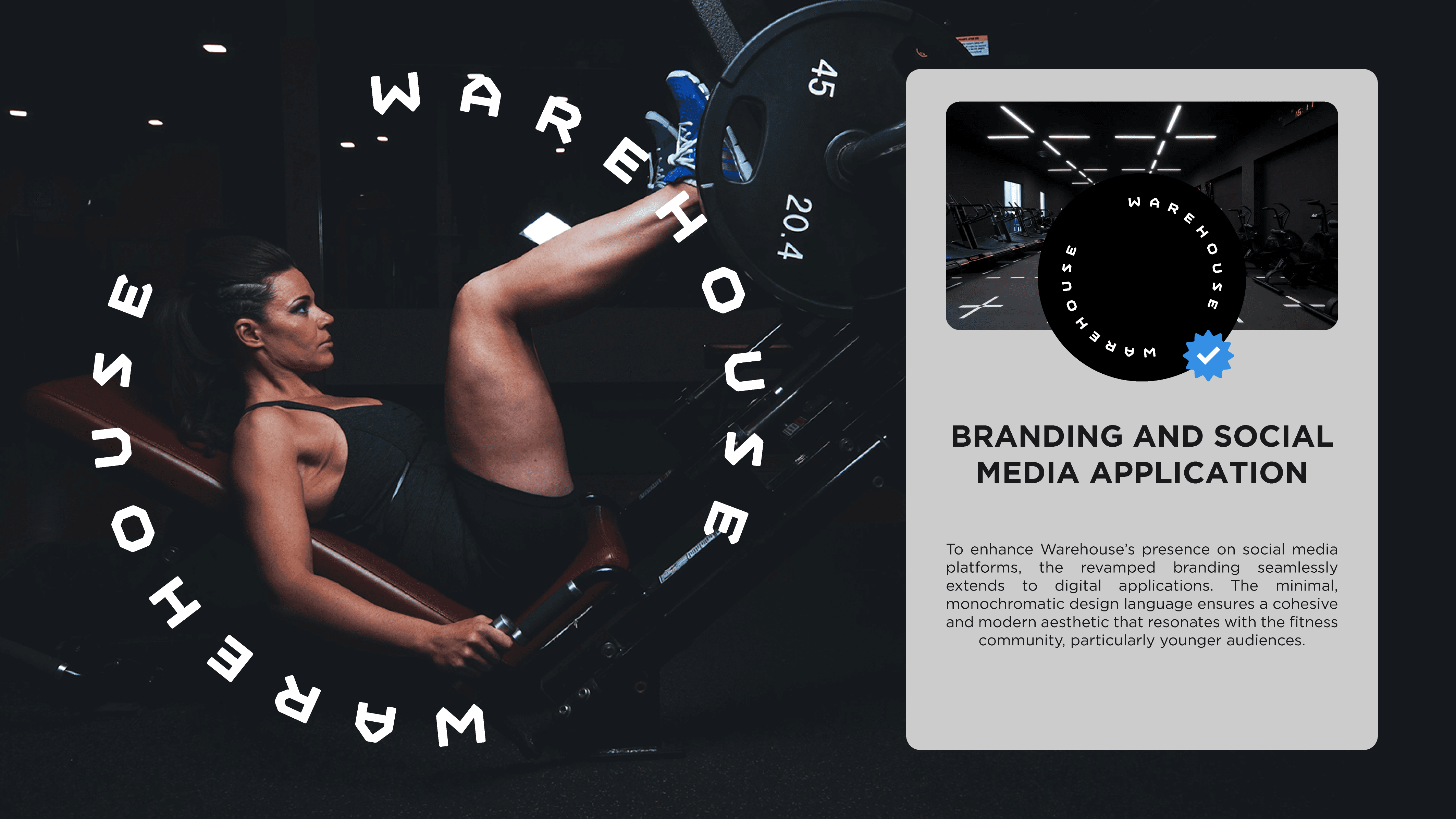
On social media, the minimal, high-contrast aesthetic translates effortlessly into digital branding, resonating with a younger, content-driven audience.
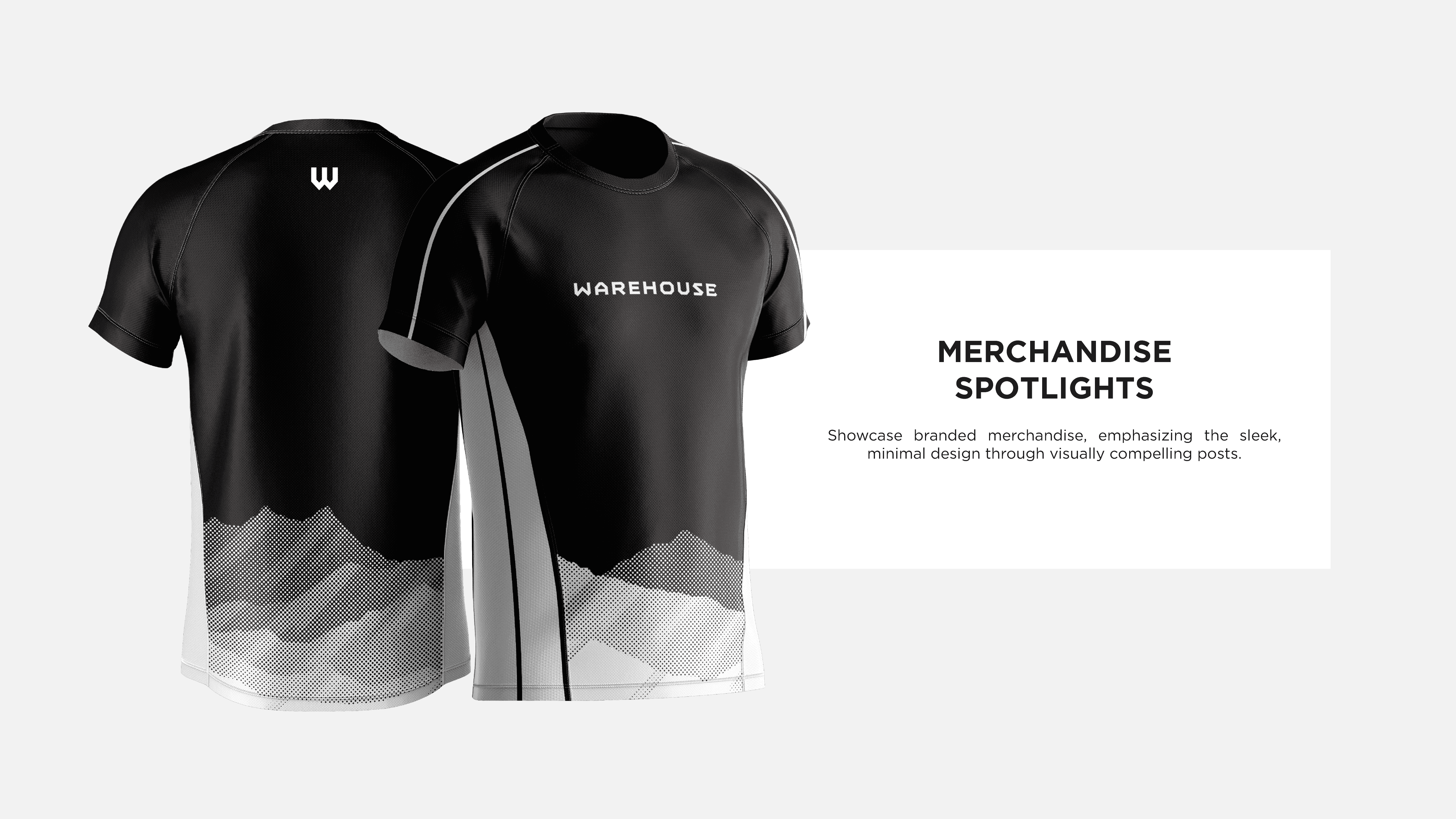
And on merchandise, the clean, wearable design has turned Warehouse apparel into a statement of belonging, an extension of the brand beyond the gym walls.
Redefining Strength in Fitness Branding
This wasn’t just a design refresh—it was a transformation. By rejecting overused fitness clichés and embracing a bold, minimal identity, Warehouse now stands as a leader in high-performance training. The brand is stronger, more recognizable, and ready for the future.
Ready to Transform Your Brand Like Warehouse Did?
Your brand deserves more than generic visuals, it needs a design system that commands attention, builds recognition, and scales effortlessly.
At Playhouse Creatives, we specialize in transforming ambitious brands like Warehouse into industry powerhouses through bold, high-impact branding. If you're ready to give your brand the visual refresh it deserves—let’s make it happen.
👉 Book a Call Now and let’s build something extraordinary.